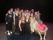
As some of you may know, I (Chester) will be designing the lighting for Poor Tom (the working title). Gen and Bonnie asked if they could help with the design. So I appointed them Associate Lighting Designers.
Here are their thoughts so far-
From Gen:
While working on the grid, I have a lot of down light as well as hi-side light.
The only colors that I really seem to want to use at this point are red and maybe some blue. I also really, really like that gobo that Bonnie used in her one-act (I think Jenny may have used it in the Shakespeare presentations as well). Also, there are a few playful scenes between Angela and Tom, or even the women when I think maybe blue would be appropriate...I am also thinking a tree gobo for those scenes (so maybe I should switch that blue to a green to go with the organic feel...), as well as maybe during some of the songs.
Although the play varies in mood once in awhile, the show as a whole is soooo depressing! My rough plan includes a lot of dim light, even sectioned off at times to convey rooms or workstations and even jail cells. Like you said about getting a sense of their lives, Chester, I agree--I think that the work is really just drudgery that they have to push through day in and day out. There is obviously very little fun, so they have to make do with what they have. The only times I have really intense lighting (at this point at least) is when someone stands up to Hannah or the priest, and then the very end with the execution.
I'm still working on stuff and thinking about it, but thanks for the grid and the emails. I'll talk to you guys soon!
From Bonnie:
I have a lot a repeated ideas, but also some new ones. I tired right now, so I'm not going to spend time repeated what has been said in great detail. I agree with you Chester in terms of the angular patterns. Gen I'm not sure which gobo you liked in my one-act. I used a jagged angular pattern laid over a floral pattern to get kind of a gypsy feel, but maybe the mixed gobo thing is something you want to pursue in this show. I agree with both of you in terms of side light all around and also down light, especially at the particularly spooky moments.
Here are a few new ideas: As I was reading through I noticed also that there seemed to be a contrast between the moments with Angela and Tom and then the spookier moments. This I thought could maybe be done with color or maybe even a slight shift to more frontlight... not sure. I also thought that a blue would be nice for the moment when they are getting ready for bed (Angela and Hannah, I think). I thought that the jail scenes should be particularly angular. I'm not sure if we're using jail gobos or if there are set pieces, but i thought another good way to indicate that there are multiple cells would be to hang single light bulbs from the electrics. (like the one that Patrick was obsessed with during the intensive in august). This would maybe give a feel that the jail is a bit run down and also light the faces of each inmate in a creepy way ( I think there are at least 3 inmates at one point, when everyone's like, "Hannah, I'm your husband") I also thought that the jailer might carry a light of some sort, even if it's a flash light, to provide some movement of light in these scenes. Also, we could tap the bulbs a bit, to get a bit of a swing. That might be kind of cool. The last thought I had was to not only have booms for ome low side light, but also maybe mount some lights to bases like we did in the intensive as well. That upward angle might be cool to play with, especially during the scenes where the women are mixing/grinding the powder.
Subscribe to:
Post Comments (Atom)

No comments:
Post a Comment